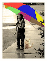
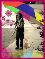
This is my first entry in semester 2. I made this entry to practice using some tools in Photoshop CS3.
Process:
At first, I chose one image which I want to play with and came up with an idea how it will look like after editing.
Then I followed these steps:
_ Duplicate layer
_ Crop Tool: removing the white frame around the image.
_ Edit Canvas Size to extend the background --> Paint Bucket Tool to colour the background.
_ Levels checking
_ Photo Filter --> Warming Filter (85) – 25%

_ Brush Tool & Healing Brush Tool: deleting the unwanted objects in the image.
_ Magic Wand Tool --> Refine Edge: cutting the cat from another image, smoothing it and pasting it on this image.
_ Painting the umbrella:
_ Lasso Tool --> Refine Edge: picking up separate areas on the umbrella which I want to colour differently.
_ Duplicate each area to separate layers and using Paint Bucket Tool to colour. (However, with some areas on the umbrella, the Paint Bucket Tool seemed not work wellL. So I Create New Layer and used Brush Tool to Brush those areas by hand).

_ After colouring the entire umbrella, I set the Blending Mode for the layer (Ex: Normal, Multiply, Overlay…) and set the master/ interior Opacity for the layer (%).
_ Quick Selection Tool --> Refine Edge: cutting the flowers from another image, again, smoothing them and pasting them on this image.
_ Making the image more interesting:
_ Rectangular Marquee Tool: drawing a rectangular area.
_ Paint Bucket Tool: colouring the rectangular area.
_ Adding Blending Mode, Texture, and Filter then using Blur to make it smooth.

_ Reference:


2 comments:
Good effort - this could be improved by adding a slight reflection underneath the cat. It looks like it's floating in the picture now.
A friend of yours directed me here for a few comments
Anyway, as Li Ping said, a reflection of the cat would make it a lot better. Moreover, you should use Blur tool and paint along the edge of the cat to make it blend in even further with the background.
My other comment is on the colouring of the umbrella, there is no shadow for the colours inside the thing at all. Paint a black layer and make 30% Opacity on top of them.
I also think the noise on the bottom left is bad. It should be blurred.
On top of that, well done.
Post a Comment