Wednesday, July 30, 2008

Tigers

For the purpose of creating an image for my poster, I used 4 images that I took from the internet to make an interesting image. My first image looks like the final result without a tiger head on the sky. My idea was " Is the tiger on the top or starting to fall down?". Then I found that I can make it better by adding a tiger head on the sky to make it seems like a conversation between two tigers. I wanted to show how close between a live tiger with a soul of another tiger, the boundary between life and death. Finally, my slogan in the poster is: "They do not want to die. They want to be safe and saved." When I was working with the poster, I came up an idea with 2 words "safe" and "saved", two words are the homophones and they likely make a trick with your mouth^^


This is my final work. I have to make it brighter than normal because of printing purpose.


Sunday, July 27, 2008

Type editing


This is the exercise about applying Grid in design a paper. In my paper, I divide it into 4 units. The main title covers 3 units, the subtitle is inside 2 units and the name of the author is within 1 unit.
I cut the image into 2 parts to make the flying person actually..fly..far above other people.
Moreover, The way I arrange the text is to show the contrast between the powerful people and the poor people as you can see in the image.
About the font, I choose fonts which have serifs because I want this paper look as traditional and serious as the concept of the text.

Saturday, July 26, 2008

Come back home


This image I created by using illustrator to draw the house then using photoshop to fill up the rest of the image. Firstly, I intended to create an image where there is a little girl looking at the moon in a dark night. However, after drawing the house, I found that it is not suitable for a girl with a dream, then I changed my idea and this is my final result. Come back home!!


This image I played around setting CMYK and RGB mode for the document and I messed it up. Then I got an image look like this one above.

Sunday, July 20, 2008

Car Tracing

This is the car that I took from the internet.


And this is the car after many hours tracing.


Finally, I add the background for my car

Sunday, July 13, 2008

Playing with Brush Tool


A friend showed me how to load more Brush Tool and I used them to make up my photograph. You can see it looks like this below.


Miracle


In this entry, I made my little cousin become a witch. I am very interested in the witch's ball. I made many layers to make the ball become more magical. I also turn the book on the left to an magic book with little tiny magic dust.


Sunday, July 6, 2008

My favourite photographs

These are some of my favourite photographs that I took in my trips in the past. I did not change or edit anything in any software. So they are good or not depending on my camera and my photo-taking skill:) Hope you enjoy my stuff.


This flower names CROSSCUS, white crosscus. I took this image in Dalat, where the weather is very nice then the flowers have wonderful colour.


This image was taken when I was travelling in Nha Trang for 3 days. I was walking in the mid-noon and I suddenly looked at the ground near my feet and I saw this sight. The sun beam shined through the leaves on a tree and went straight to the ground. It made a wonderful bright area around a small little tiny leaf already there. That was so amazing!!


This photograph I took in Nha Trang too. I was standing in a high position and having a wide view of the seaside. For a moment, a multicoloured-parachute appeared on the blue colour of sea water. The colourful parachute attracted my eyes and it makes the boring sight of the sea become more interesting. Moreover, the island on the right balanced with the parachute nearly on the left of the image. That's good, isn't it?


We have learnt about symmetry. This image has an effect relating to "Mirror Lake" - "Reflection of the landscape in still water". I took it in Dalat. These pictures below are from the internet.


_ http://www.panoramio.com/photos/original/2529306.jpg


_ http://www.digitalfieldguide.com/blog/date/2005/05


MY SECOND ENTRY - Glorious


This image is a combination of my photographs of different kinds of flowers that I took in Dalat. I love taking pictures of flowers and beautiful scenery so that I will post another entry containing a numbers of my photographs.

About this image, my inspiration came from the annual event in Dalat:” Dalat Flower Festival”. I used the pictures of my little cousin looking at the air with passionate eyes to show the love of flowers. The photo of Mimosa, a kind of flower, was edited to make the yellow mimosas standing out of the blur background. I also cut different flowers from other images and added them on this.

Going through my process, I used Lasso Tool, Quick Selection Tool, Brush Tool, Healing Brush Tool, Clone Stamp Tool, Paint Bucket Tool, Eraser Tool, and Horizontal Type Tool and so on.


Thursday, July 3, 2008

MY FIRST ENTRY


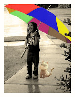
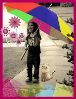
This is my first entry in semester 2. I made this entry to practice using some tools in Photoshop CS3.
Process:

At first, I chose one image which I want to play with and came up with an idea how it will look like after editing.


Then I followed these steps:
_ Duplicate layer
_ Crop Tool: removing the white frame around the image.
_ Edit Canvas Size to extend the background --> Paint Bucket Tool to colour the background.
_ Levels checking
_ Photo Filter --> Warming Filter (85) – 25%


_ Brush Tool & Healing Brush Tool: deleting the unwanted objects in the image.
_ Magic Wand Tool --> Refine Edge: cutting the cat from another image, smoothing it and pasting it on this image.

_ Painting the umbrella:
_ Lasso Tool --> Refine Edge: picking up separate areas on the umbrella which I want to colour differently.
_ Duplicate each area to separate layers and using Paint Bucket Tool to colour. (However, with some areas on the umbrella, the Paint Bucket Tool seemed not work wellL. So I Create New Layer and used Brush Tool to Brush those areas by hand).

_ After colouring the entire umbrella, I set the Blending Mode for the layer (Ex: Normal, Multiply, Overlay…) and set the master/ interior Opacity for the layer (%).

_ Quick Selection Tool --> Refine Edge: cutting the flowers from another image, again, smoothing them and pasting them on this image.


_ Making the image more interesting:
_ Rectangular Marquee Tool: drawing a rectangular area.
_ Paint Bucket Tool: colouring the rectangular area.
_ Adding Blending Mode, Texture, and Filter then using Blur to make it smooth.


_ Reference: