Friday, October 31, 2008

SEMESTER 3

I have created a new blog for SEMESTER 3 - Electronic Imaging and Design - Mr. Thierry Bernard
If you have no idea about my new blog, please follow this link:


Friday, October 24, 2008

Friday, September 26, 2008

Saturday, September 13, 2008

Portfolio flash

I got the mark for my portfolio and I will up my portfolio in here so you can have a look at it. Enjoy!! ^^


If the file does not work, you can try this link below:

"”Portfolio” [Flash movie], 2008, Nguyen Thi Bao Ngan, viewed 4 July 2008."

Sunday, September 7, 2008

Final project


With this final project, I have a big problem with background music. If you click on Start and replay button the second time, I think you will need to refresh the page otherwise you will get headache with the music..Unlucky me!!! :(

My Illus

I draw all the materials for my final projects. Firstly, I tended to draw by hand then scan the pictures. However, I finally found that I do better on Illustrator so I decided to draw by Illus. Here are my works:


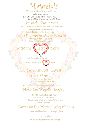
Those are the steps in my tutorial. It is very easy to make a flower wreath following these 7 steps ^^.


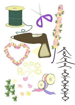
Those are the materials for my tutorial. Some of them are unreal, but I like making them lovely materials.

Sunday, August 31, 2008

Theme for my final project _ Flower wreath tutorial


This is the background image for my tutorial. I will give the options to the users about different types of flower wreath tutorials such as wedding, birthday and Christmas. I think this is a challenge for me and I will try my best.

My video project

Children_The same world but different destiny


Sunday, August 24, 2008

Creativity with MAC OS

Create art work on MAC OS desktop with icon and folders.

Those people with unlimited creativity tried something different from other and you can see what they get, interesting!


"”'Siêu phẩm' từ biểu tượng trên màn hình máy tính (Super art works created by computer icons)” VnExpress"


"”Xếp đầu lâu, khủng long từ folder trên desktop (Art work created by folders from desktop)” VnExpress"


Creative movie clip made by Dennis Liu


This is an unbelievable movie clip. It was made by a professional film maker Dennis Liu in 3 months. He used the song "Again and Again" and created the effects in MAC OS with many programs, software and his very quick manipulation. Check it out! ^^


Video source: www.youtube.com

"”Clip trên nền desktop gây kinh ngạc giới sử dụng Mac (Movie clip on MAC OS desktop surprised MAC users” VnExpress"
Document source: www.VnExpress.net

Home decoration website

This is a website where we can design the basic design for a room including the material for the floor, the color and design for the ceiling, wall, etc.
"”Design a Room” iVillage."

This is as simple as a game; however, I found that it is useful because I love home decoration and playing with colors so that I can combine it when I actually choose a color for a room.


Sunday, August 17, 2008

Trace me

I traced my face using Ai. I would say that after tracing the car, I found that I quite love this process. I changed the colors of the background for the purpose of showing my different feelings. So you can see how effective the color can bring to your images.^^

I am innocent.

My lovely face in a white space, no limit is created, nothing can stop my great smile :p. Pink color brings a soft mood and happiness also.

I am happy and I am in high spirit.

Yellow color create the feeling of joyfulness.

Romantic color, I am in love ^^. Tender mood.


In this image, you can see that I am in a little trouble because those stuffs around my head become quite messy with the blue spirals. However, you can feel a bit relaxation mood cause the background is brown.


The last image with dark blue background and yellow stuffs around my head. I am deep in sorrow. While I still smile, it's just like I am pretending, trying.


I like playing mixing the color and it create very interesting effects, you see. Color is a wonderful tool that you can use in design especially for emotional design. You can even create your own style of color while you are free in using any shape and font in your work. The unique style of color will sign your work without any word.
Wednesday, August 13, 2008

Theme for my porfolio

This is the background for my page in my portfolio.


My idea is an old pink wall with a window a everything will be made from wood ^^

Sunday, August 10, 2008

Photo masking

This effect which I will show you might be useful for your portfolio. It is called Photo Masking.


Firstly, you import 2 images into library. What I have done in this Flash is using 2 same images, one is black and white color and another one is colored. I will put the black and white image as the background. So that you need to put the layer of the black and white image under the colored one.


Then create a new layer and draw any shape you like, in my example, I use rectangular shape.


To make it more interesting, you create a new layer and draw 2 parallel lines at 2 sides of the rectangular. Then you group 2 lines, convert the shape and the 2 lines to graphic symbol. After that, you make it move from left to right with any style you want (slow, fast, how many times,...)


Finally, make the layer of the rectangular as mask.


This is a very simple example, use your creativity and you will be surprised!! :)

Links:
"Photo Masking"
"Masking in Flash"

Cool effect with masking

In this entry, I will give a tutorial about flash effect: Masking.


Firstly, you create 2 layer like this:


Secondly, you create a new layer. Use paint tool to draw the area that you want to be highlighted.


Then you erase the outline by using eraser tool.


Choose the whole area and group it, then convert it to movie clip.


Double click on the movie clip symbol "Mask" that you have just created. Inside the symbol, you will create a new layer and name it "light".


On the "light" layer, you will draw a small rectangular and set the fill of the rectangular like this.


Then move the rectangular from left to right, make sure that it goes through the area that you want to highlight.


Finally, right click on the "mask" layer and choose Mask.


It's easy! Do it and enjoy it^^

Link:
"Cool Flash Masking Effect"

Sunday, August 3, 2008

Flash_exercises

Canon_start


Follow through


I cannot understand why the movement of the hand is so strange when I upload mov file on here. You can right click on this image below and open in a new tab to see my work.^^


Half of the semester, we will study and work with flash all the time. And this is the first exercises that I have learned in class so far.

Wednesday, July 30, 2008

Tigers

For the purpose of creating an image for my poster, I used 4 images that I took from the internet to make an interesting image. My first image looks like the final result without a tiger head on the sky. My idea was " Is the tiger on the top or starting to fall down?". Then I found that I can make it better by adding a tiger head on the sky to make it seems like a conversation between two tigers. I wanted to show how close between a live tiger with a soul of another tiger, the boundary between life and death. Finally, my slogan in the poster is: "They do not want to die. They want to be safe and saved." When I was working with the poster, I came up an idea with 2 words "safe" and "saved", two words are the homophones and they likely make a trick with your mouth^^


This is my final work. I have to make it brighter than normal because of printing purpose.